I know this is like the very definition of “white people problems,” but, man, I cannot stand when it comes time for a film’s DVD release, and the studio bypasses a perfectly awesome movie poster in favor of photo-shopped nonsense for the cover art. It’s quite mind-boggling, really – these studios invest what I’m sure is a lot of money into hiring talented artists and designers to create eye-catching posters that will grab your attention in a theater lobby, but when they get to the DVD stage they just throw it all out and instead go with something that looks like the 31st highest-ranked entry in a “create your own movie poster” fan-contest.
Generally speaking, if your name isn’t “The Criterion Collection,” you really shouldn’t bother messing with the film’s original poster image when deciding on the DVD cover. I mean, those posters were created with the sole intent of representing the film. Why bother going through the extra work of creating a new image, when you’ve had a tailor-made one already set for months? This sort of unnecessary tinkering has resulted in a lot of truly awful DVD covers – too many to mention here, really (perhaps I’ll devote an upcoming column to the some of the most glaring past examples). But the recent reveal of the upcoming Drive DVD/Blu-ray has unveiled one of the most baffling design choices in recent home video history.
Drive, of course, is Nicolas Winding Refn’s superb L.A. set crime drama, starring Ryan Gosling as Driver, a brooding mechanic/stunt-driver who moonlights as the city’s best getaway driver for hire. Over the course of then film, Driver finds himself embroiled in a brutal quest for revenge, after his attempt to protect a beautiful neighbor and her son goes horribly wrong. After earning massive buzz – and a Best Director prize for Refn – at the Cannes Film Festival, Drive went on to become one of the year’s most critically acclaimed films, with many (including this author) pointing to its returning of a much missed sense of “cool” to cinema screens. And “cool” really is the best way to describe the film – from Gosling’s stoic, silent performance; to Refn’s unique visual style and Newton Thomas Sigel’s beautiful nighttime photography; to its retro-tinged electro-pop soundtrack, Drive is a film that just drips “cool” off its every frame. And this was true of its advertising campaign, as well – the film’s stylish, neo-noir aesthetic was highlighted in a series of excellent promotional posters and banners. Let’s check some of them out:
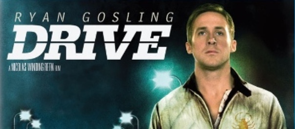
This image – taken from the very beginning of the film – is notable for highlighting Driver’s already iconic scorpion jacket, one of his character’s most memorable attributes.
Here we have more of a “Hollywood-style” poster, showing Driver in action, doing what he does best. I like it, but I think it’s improved upon by what (to the best of my knowledge) ended up as the film’s final theatrical poster:
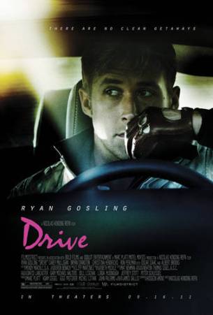
Now this is a great fucking Drive poster. For one thing, “there are no clean getaways” is a perfect tagline for the film. Also, by placing Gosling behind the wheel, it still lets you in on his occupation of choice, but I love that instead of an action moment it’s instead focusing on those crucial moments where Driver is simply waiting for his partners to finish their job before the actual getaway. There are two of these moments in the film, and they are both incredibly suspenseful. Plus, this poster shows off Driver’s toothpick fixation, a small but notable character quirk. And best of all, it features the film’s hot-pink title logo, an instant indicator of the film’s hip style.
Three great posters, any one of which would make for a terrific DVD cover. Given that, I was optimistic that the upcoming DVD’s disappointing extras selection would at least be somewhat made up for with a sweet-looking DVD. I mean, with images like these to choose from, how could Sony go wrong?
Well, umm……
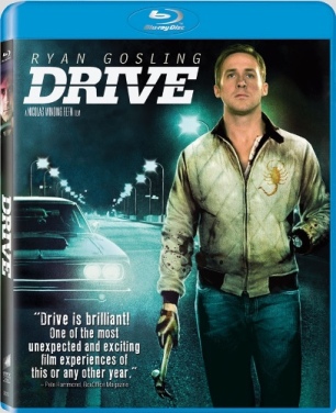
Seriously, what is this? This has to be a joke on Sony’s part, right? No? This is the real deal? Oh…man.
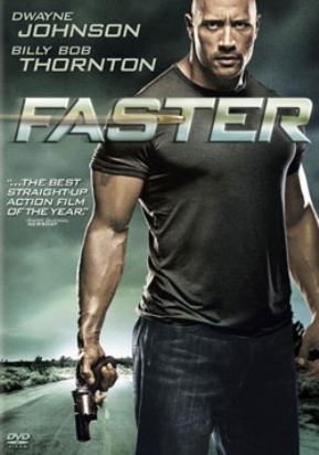
I suppose this probably has something to do with Sony’s disappointment over Drive’s underwhelming box-office performance, which they’re probably blaming on the film’s “too cool for school” art-house buzz – buzz that almost certainly kept away a large segment of the average movie-going public (not to mention resulted in one of the funniest lawsuits in human history, when a woman apparently distraught that Drive was not the stupid Fast & Furious clone she expected it to be, sued its distributor for false advertising). And so they have responded by saddling Drive with the same sort of lame, uninspired cover image that usually graces films like…
and…
Now, beyond the fact that Ryan Gosling is not The Rock, let’s consider some of the other obvious problems with the Drive cover.
First off…Pete Hammond? Really? Out of all the critics that raved about the film, the best blurb they could find was from Pete Hammond? In terms of journalistic credibility, Pete Hammond only ranks slightly ahead of David Manning, the fictional critic Sony once created to give positive reviews to shitty movies like A Knight’s Tale and The Animal. Look, I’m glad Hammond enjoyed the movie and all, but his recommendation is roughly equivalent to when the mouth-breathing clerk at Blockbusters tells you to check out Season of the Witch.
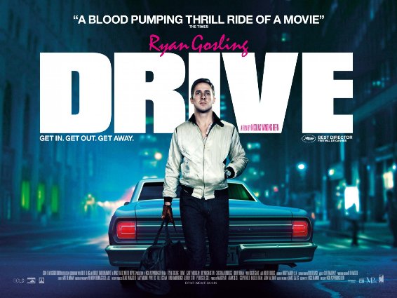
Second, just look at the quality of that image. There’s bad photo-shopping, and then there’s whatever the hell this is. And I know it’s photo-shopped, because the picture of Gosling is actually taken from yet another actual Drive poster that they didn’t deem worthy enough of using:
Thanks to that flash of hot-pink, the tagline, and the impact of the film’s title behind Gosling, this version of the poster is actually pretty decent. But I guess it just didn’t seem “tough” enough for Sony, so they decided to dirty up his jacket, add the scorpion logo onto the front (which fans of the film – and the jacket – know is bullshit), swap out the bag with a hammer, and then throw some MS-Paint worthy blood onto his sleeves. BAM – instant action cover! Never mind that all that digital manipulation makes Gosling look like some sort of half-finished reject from The Adventures of Tintin. I saw Drive twice, and I certainly don’t remember any scenes where a wax statue of Gosling glowed like some sort of ethereal angel.
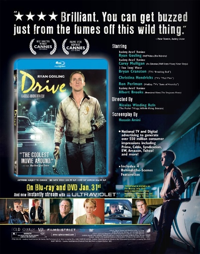
What’s even more shocking about this terrible cover is that it actually appears to be the second attempt at it. This trade ad shows a different, slightly better version:
Sure, they chickened out on the hot-pink, but at least this one had the more visually appealing version of the film’s title. And the blurb, while perhaps a little more simplistic, still came from A.O. Scott. You know, a real critic (not that I dare insinuate that Box Office Magazine is any less reputable than the New York Times). But, apparently, at some point somebody at Sony looked at this version and said “hey, we’re not finished yet. There are two good things about this cover, and we have to get rid of both of them!”
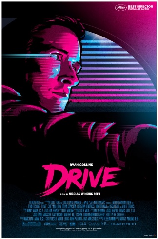
Hey, I understand there are far more pressing issues in the world today than whether or not the Drive DVD looks cool, but that doesn’t mean a little more effort couldn’t have been put into designing the damn thing. What’s really frustrating is that I have to buy it anyway, shitty cover and disappointing extras and all. While I hold out hope for an eventual extras-laden Criterion release, there is no part of my soul that will dare allow me to wait on owning this awesome movie. So, yes, I’ll be buying this – but I’ll most likely immediately go about printing up my own cover to replace the one they’re going with. Any of the film’s original posters would be fine, but actually, I think I might just go with this terrific piece created by James White of Signalnoise Studio.
I just want to point out that White made that poster for free, whereas Sony actually paid somebody to come up with this crappy abomination we’re actually getting. Now do you see why I get upset when DVD covers are so bad? There are literally thousands of fans out there who would gladly design far superior images for most of these things.
Oh, well, soon I’ll own the Blu-ray, and I’ll eventually get over this whole thing. After all, it’s probably just a one-time lapse of judgment on Sony’s part, right? I’m sure they’ll never again go with such a laughable, poorly photo-shopped cover for a similarly acclaimed film. That would just be silly.






You know what would be a cool site?
A site that can sell elegant fan-submitted artwork for DVDs and Blu-rays. Maybe it can be vote driven, like Threadless. The only problem would be the legal side of it.
Either way, it’s baffling to see Sony making a Blu-ray cover like this; it’s almost it’s done out of spite.
Take a look around the Internet – it’s not hard to find quite a few sites where you can download fan-created DVD and Blu-ray covers. Usually they are actually free, which gets around the legal side of it – it sure as heck isn’t against the law to make your own cover to replace the one you have.
Thank you: all of this needed to be said, including the ‘Take Shelter’ part.
I know I’m coming late into this, but I couldn’t agree more. A terrific film, a good film poster that really conveys the tension in the main character, but a dvd/blu-ray cover that is just awful.
Because the quality of the artwork and packaging for discs is plummeting, I wrote a polite and balanced e-mail to every film studio and major distributor. But, despite their mail servers acknowledging that my e-mail had been received, I didn’t receive one reply.
That says it all. I really just don’t think they give a toss.